Product and visual designer working between digital interfaces and physical media, with a focus on brand identity and narrative for creative fields.
Contents
Printmaking and Publications Features
My printmaking work and photography/illustrations featured in publications (Agora Magazine and Dibner Art Showcase).
Printmaking, Collage Design, Illustration
Fall 2022, Spring 2023 & 2025
Tools — Etching Ink, Copper Plates, Printing Press, Acrylic Paint, Birchwood, Laser Cutter, Paint Pens, Canvas, Cyanotype Paper
Agora Magazine
NYU Grossman School of Medicine | January 2023
Featured two of my illustrations in Agora Magazine, with the theme being 'Transitions.'
Dibner Art Showcase
NYU Libraries | October 2022
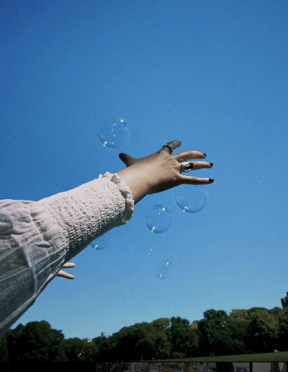
Featured two of my illustrations and photography in Dibner's 2022 Art Showcase, with the theme being 'Hope.'
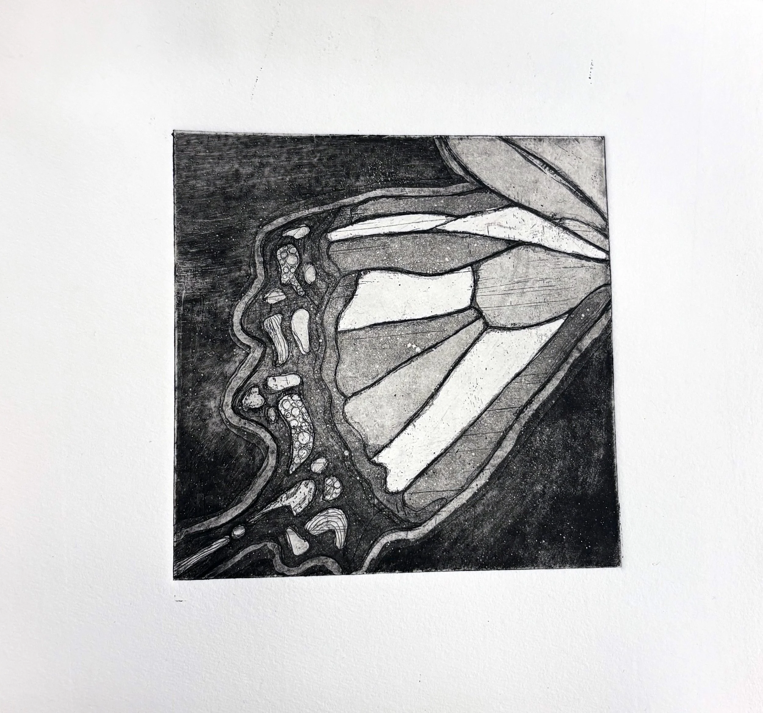
Etching Series (Copper Plate & Printing Press)
This series was created using traditional etching techniques on copper plates, printed with a press. I drew inspiration from natural forms and personal pattern-making, focusing on zooming in on details rather than on full scenes to explore scale and abstraction. I also experimented with color using stencils, adding layered variation to the prints.
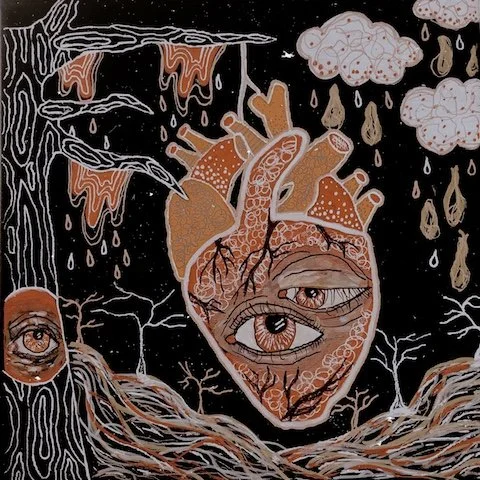
Linocut & Laser-Cut Series (Linoleum & Birchwood)
Building on the themes of my etching work, this series combined hand-carved linoleum prints with laser-cut patterns on birchwood. I continued to explore nature-inspired motifs, incorporating elements from my own photography and translating realistic imagery, like hands and trees, into more abstract forms.
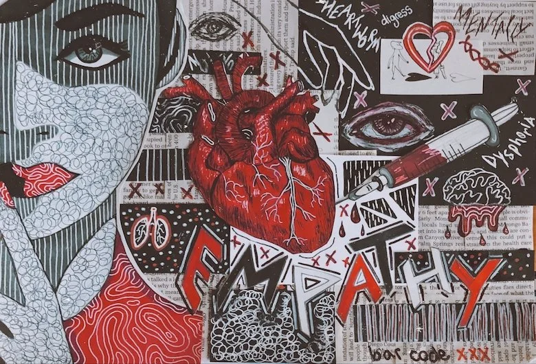
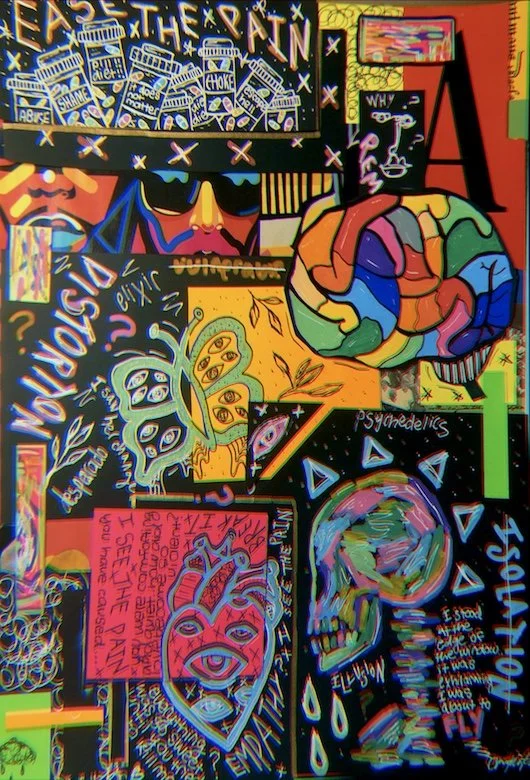
Cyanotype Collage Series
This series was created using cyanotype techniques, combining stencils made from my own film photographs with found objects from my home. Each piece was contact-printed onto cyanotype paper and then hand-collaged.
Master Copy Sculpture
A 3D reimagining of Daniel Spoerri’s iconic snare-picture, blending historical context with contemporary digital techniques.
3D Modeling, Art History
September - October 2024
Tools — Blender
This project was inspired by my interest in Dada and Nouveau Réalisme, which I explored during a History of Berlin course. Artists like Duchamp, Höch, and Grosz deeply influenced how I think about the meaning of art, especially how readymades and context can reshape perception. I aimed to recreate an everyday moment through 3D modeling, emphasizing concept, process, and storytelling over perfection.
Because I also care about product and interior design, this felt like a chance to blend historical influence with digital skill-building. And since I love photography, I was especially excited to treat the final render like a photoshoot, thinking about lighting, angles, and presentation.
Ideation
History
The piece is based on Daniel Spoerri’s Kichka’s Breakfast I (1960) (pictured on the left), part of his snare-pictures series. Spoerri collected and fixed everyday breakfast objects—like dishes and silverware—precisely as they were left, and mounted them vertically as art. His work, rooted in Nouveau Réalisme and Dada, encourages viewers to reflect on time, routine, and consumer culture. By transforming the ordinary into something worthy of attention, he blurred the lines between life and art.
I began by modeling the larger scene in Blender, sculpting key elements like bowls, a cooking pot, cloth, and chair details. Sculpting the cloth by hand (rather than using a texture) gave the piece a more natural, personal touch.
Texturing and UV wrapping were time-intensive, especially scaling labels for the can to look accurate, but worth the effort. I lit the scene using an HDRI with an infinity backdrop to give it the clean, almost photographic look of a gallery setup.
Process
Steps
Modeled basic forms
Sculpted details and organic shapes
UV unwrapped and textured key elements
Built lighting setup and backdrop
Final renders treated like product photography
I’m proud of how this piece turned out, especially the modeling, lighting, and how much I learned through problem-solving. This project deepened my understanding of texture mapping, sculpting organic materials, and the importance of how a piece is presented. It also reminded me how concept-driven work can be just as impactful as perfectly polished design.
Blending historical context with digital tools made the project more meaningful. It reminded me that everyday objects, when framed intentionally, can hold weight, memory, and beauty.
Reflection
Heels for a Jazzy Night Animation
3D Modeling, Motion Graphics, Animation, Video Art
November - December 2024
Tools — Adobe After Effects, Procreate, Blender
Heels for a Jazzy Night is a 30‑second animation that follows a pair of heels on an evening adventure, from a mysterious arrival in a box to the dance‑floor glow of a jazz club. The brief was simple: tell a story through a pair of shoes. I leaned into the romance of late‑night city streets, Art‑Deco‑meets‑Bauhaus geometry, and the shimmer of moonlight on polished pumps and stilettos. Abstract figures, organic shapes, and bold color blocks move in rhythm with a swing‑inspired soundtrack, creating a playful fashion vignette that feels equal parts collage, music video, and dream sequence.
Overview
Goals
Explore hybrid animation (2D in Procreate & After Effects, 3D in Blender)
Tell a visual story through movement, typography, and transitions
Experiment with character abstraction (legs, shoes) and collage techniques
Develop a short fashion-focused animation with a jazz-inspired tone
Process and Visual Identity
I started by gathering visual inspiration, heels in motion, bold silhouettes, playful leg styling, and sketched out a storyboard to map out the energy and pacing of the piece. From there, I developed my assets: modeling shoes and simple environments in Blender, creating textured 2D elements and motion graphics in Procreate, and combining both worlds in After Effects for final animation.
The visual language blends abstract color blocks, curved organic forms, and clean Art Deco-inspired geometry, creating a layered, jazz-infused mood that plays with contrast, rhythm, and style.
Step 1: Storyboarding & Inspiration
Sketched out scenes and transitions in Procreate and gathered visual references; heels in motion, abstract legs, and bold night city shapes.
Step 2: Visual Language
Defined a style blending collage-like color blocks, organic curves, and geometric forms inspired by Bauhaus and Art Deco posters.
Step 3: Asset Creation
Built 3D assets like shoes and boxes in Blender, and created 2D elements: textures, type, and illustrations, in Procreate.
Step 4: Animation Pipeline
Composited scenes in After Effects, blending 2D and 3D assets with synced transitions and camera moves to match the jazz rhythm.
Step 5: Refinement & Rhythm
Refined cuts, lighting, motion easing, and text overlays to keep a consistent tone while allowing playful shifts in pace and scale.
3D Asset I made in Blender
2D Asset I made in Procreate
3D Asset I made in Blender
This project really helped me explore how to tell a story by combining mixed media, 2D, and 3D, in a way that feels cohesive. I learned a lot technically, especially working between Blender, Procreate, and After Effects, and figuring out how to bring those elements together fluidly. There was a lot of trial and discovery, but I really enjoyed that process.
One of the biggest takeaways was learning how to create a sense of brand, not just visually, but through tone and rhythm. The audiovisual choices needed to match the shoe's energy and personality. In my case, heels felt like they belonged in something a little more stylized, artsy, jazzy, a bit theatrical. So the scenes, sound, and visual language were all designed to reflect that. That’s what brand means to me: making sure all the pieces speak the same language.
We also worked within a creative constraint: the story had to revolve around a pair of our own shoes. That prompt gave just enough structure while still leaving room to experiment, and I think it pushed me to be more intentional with how I framed the entire piece.
Reflection
Final Prototype
Secret Animosity
A choice-based interactive story about friendship, tension, and how the people around you can quietly change who you are.
Game Design, Illustration
June - July 2025
Tools — Twine, Procreate, HTML/CSS, JavaScript
Secret Animosity is a choice-based psychological narrative about friendship, tension, and identity. You play as “the quiet one” on a road trip in a foreign country with three friends. A strange encounter at a remote gas station sets off a chain of subtle conflicts, forcing you to decide how to respond, whether you speak up, stay quiet, or push back.
Your interactions gradually shape your inner voice, pulling you closer to one friend’s worldview, pushing you away from another, or helping you find your own perspective. Small choices accumulate into larger shifts, influencing not only the group’s dynamic but also who you become by the end of the trip.
The game blends conversational decision-making with a moody visual style of deep reds, yellows, and blues, hand-drawn elements, and abstract imagery. The result is an experience that feels familiar but slightly off, a quiet tension that lingers even after the story ends.
Gameplay and Mechanics
Choice-based interactive narrative
Multiple endings based on player alignment with characters
Dialogue system written and built in Twine (Sugarcube)
Tools: HTML/CSS, JavaScript, Twine, Procreate
Overview
I enjoyed the process of building a story from scratch, practicing storytelling, shaping characters, and exploring the psychology behind group dynamics. It was also a chance to merge my own handmade art with new tools, combining illustration, digital graphics, and code. Seeing my characters and dialogue come alive in an interactive format made me think differently about pacing, visual tone, and how small choices affect the player’s experience.
Key Takeaways
Graphics Preview
Want to Play Secret Animosity? Link to Current Prototype Here.